This is the first of hopefully many posts about my self-publishing journey while I was writing my first book.
Cover & Title Design
Unlike many authors, I have a background in web design and Photoshop so I naturally wanted the challenge of both writing and designing/laying out my book. This proved an incredible learning experience for me. Writing the book was a journey in of itself but more on that later.
In this post I would like to highlight some of the major milestones and provide a few helpful tips regarding cover design. First, let’s break things up visually with an image I designed for my title page:
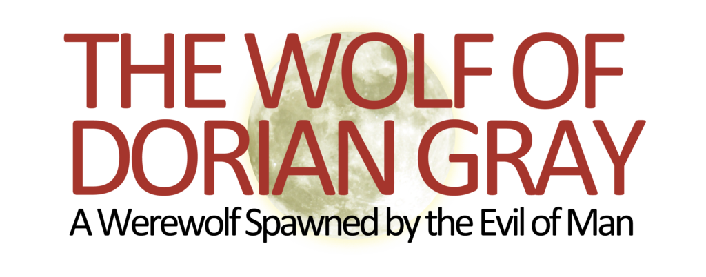
A great resource to buy large, high-resolution images like the moon in the background is ShutterStock.com. There are plenty of other stock photography sites as well. The key is to get a large for print size (as well as buy the rights to use in print and eBook format) and then to modify the image. In this case, I changed the color of the moon, added some lighting effects, made it semi-transparent, added a glow effect, and put it behind the title of my book. You will notice that the actual cover of the book has the moon in a different location, is heavily misted with fog, and also has an image of Big Ben in the background:
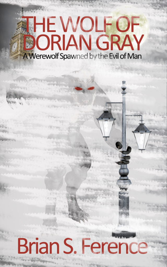
The cover of the book took quite awhile to design and the fog and mist effects required custom brush shapes in Photoshop and several versions. The eyes were enhanced to glow red (I tried several different sizes and effects), and the claws are actually cut out and pasted on top of the lamp post to give the effect that I wanted of the werewolf reaching out from behind to mist to you the reader.
If you do not have the necessary design skills or budget to have it professionally done, I recommend a site like Fiverr. Again, make sure that you are buying the rights to any images used for use in mass print and eBook production and distribution.
Since we are talking about the cover we should also discuss the back page and author page. My author photo was taken by my brother Dave Ference who is a professional photographer. We tried several different locations and poses. A few interesting items to note about myauthor photo:
- Although I do wear glasses, these were the cheap kind that I purchased from Walgreens. My brother recommended removing the lenses to reduce glare in the picture. It’s a good thing I used the cheap ones, as I ended up nearly cutting my hand and destroying the frame as I used a hammer and screw driver to smash out the stubborn left lens which wouldn’t squeeze out like the right one had. I know what you are thinking but there weren’t any screws on the frame to loosen so it was really the only way.
- We settled on a serious, frowny-face despite the objection of my wife and kids. Although I may look angry, I was trying to convey an intensity and passion that my normally smirking face doesn’t always show.
Here is a black and white version of the photo:

In my next post I will talk about some of the layout templates I used to write the book for Kindle version and for conversion to 6×9 print paperback and hardcover as well as some of the self-publishing print services that I used.